

ALL BLOG POSTS
/
UI Design
AI Finance App Design: A Complete UI/UX Case Study

Nikunj Chauhan
Author
Money is personal, yet most finance apps feel cold, confusing, and overwhelming. At Artonest Design Studio, we build products people actually want to use not just beautiful interfaces. Finewise is our AI-powered personal finance app that combines smart technology with warm, intuitive design. This is a complete UI/UX case study of how the Artonest team designed Finewise from user research and branding to the final product across mobile, web, and Apple Watch.
Why Most Finance Apps Fail Users
Before we opened Figma, we asked the most important question a UX team can ask: Why do people abandon finance apps?
Our research uncovered a clear pattern. Most users leave finance apps within the first two weeks not because they do not care about money, but because the apps make them feel stupid, anxious, or bored. The interfaces are cluttered. The data is hard to read. The onboarding is overwhelming. And there is zero sense of personalization or emotional intelligence.
Here is what users told us they actually wanted:
• A clear, calm dashboard that does not feel like a spreadsheet
• AI that gives them real advice, not just data dumps
• Goal-setting tools that feel motivating, not stressful
• An app that works beautifully on their phone and computer
• Dark mode (always dark mode)
With these insights locked in, the Artonest design team had a clear creative brief: design a finance app that feels like a trusted friend who happens to be a financial expert.
UX Research and Empathy Mapping
At Artonest, every project starts with people not pixels. Our UX research phase for Finewise included competitor analysis, user interviews, and detailed empathy mapping. We studied the leading finance apps on the market including Mint, YNAB, Personal Capital, and Copilot and mapped their strengths and weaknesses across five key dimensions: onboarding experience, dashboard clarity, AI features, customization, and emotional design.
The competitor analysis revealed a significant gap in the market. Most apps were either too simple (lacking depth) or too complex (overwhelming for everyday users). None of them truly leveraged AI as a copilot a proactive guide that helps users make smarter decisions in real time.
This was Finewise's opportunity
Our empathy map for the primary Finewise user a 25 to 40-year-old professional managing personal finances revealed four key emotional states:
Think and Feel: They feel overwhelmed by numbers but want to make smart financial decisions. They worry about the future but are too busy to plan carefully.
Hear: They hear advice from friends, podcasts, and social media often conflicting and confusing.
See: They see friends posting about investments and savings goals on social media and feel like they are falling behind.
Do: They check their bank app occasionally, avoid budgeting tools because they feel too rigid, and make impulse purchases they later regret.
This empathy map guided every design decision we made. When a user feels overwhelmed, the interface should be calm. When a user feels behind, the app should celebrate small wins. When a user is confused, the AI should step in with a clear, friendly explanation.
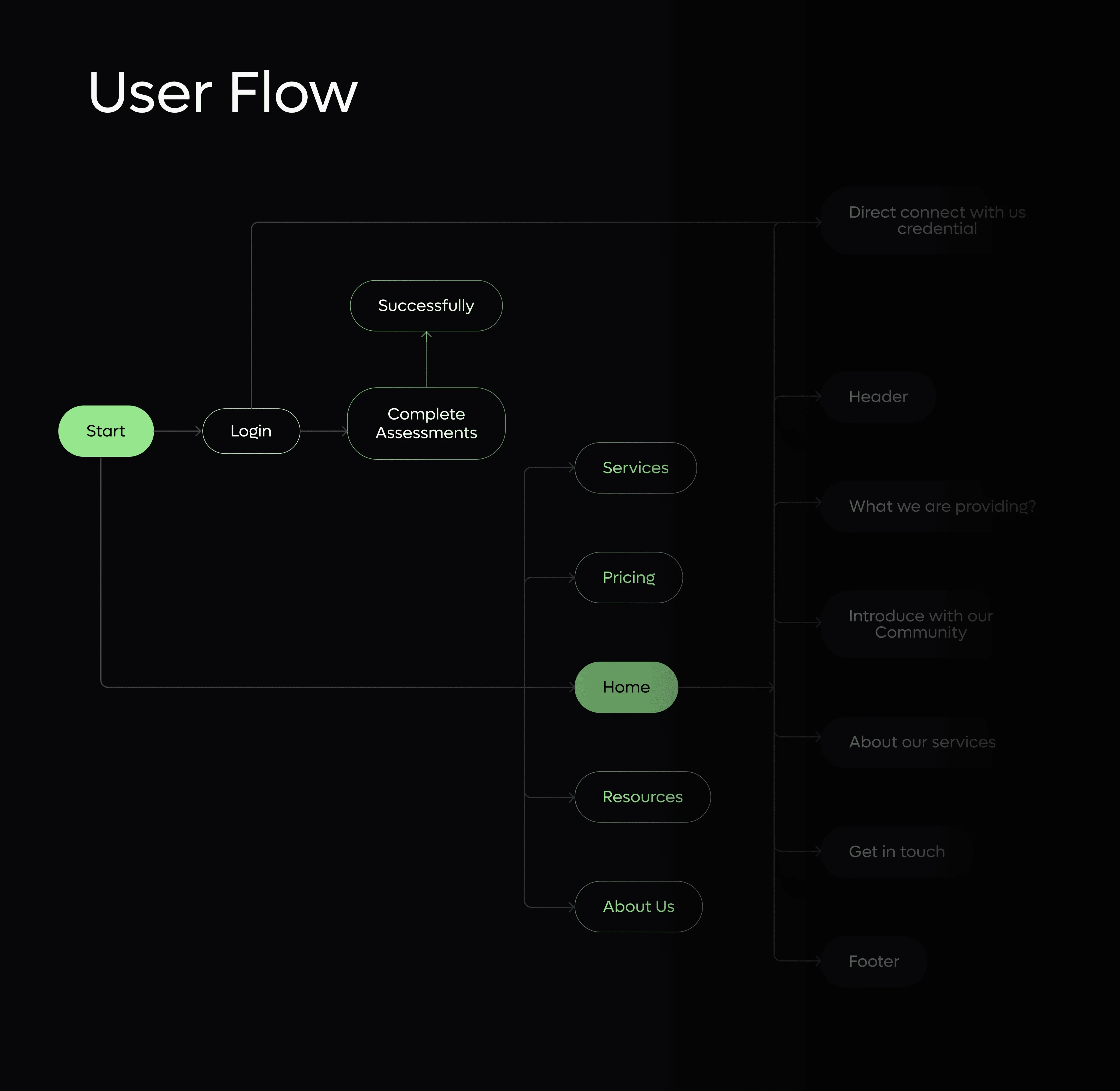
User Flow Mapping
From research to wireframes, our Artonest designer team mapped out the complete user journey inside Finewise. The key user flows included:
• Onboarding and personal data input (income, expenses, goals)
• Daily dashboard overview
• AI copilot interaction for financial advice
• Expense tracking and categorization
• Investment monitoring
• Goal progress tracking
• Apple Watch quick-glance summary
Each flow was designed to minimize friction and maximize clarity. Users should never feel lost inside Finewise. Every tap, every screen, every interaction should feel natural and purposeful.
Branding and Visual Identity
The Finewise Logo
A finance app's logo must do two things at once: communicate trustworthiness and signal innovation. At Artonest, our branding team designed the Finewise logo to achieve exactly that. The logo features a clean, modern wordmark paired with a minimal geometric symbol that evokes growth and forward momentum. It works equally well in full color, monochrome, and reversed on dark backgrounds essential for a product that supports both light and dark modes.
The logo was also designed to scale perfectly from a tiny Apple Watch display all the way to a large desktop monitor. This level of brand consistency is a hallmark of every Artonest branding project.
Typography
Typography in finance apps carries enormous weight literally and figuratively. Numbers need to be readable at a glance. Headings need to feel confident. Body text needs to feel approachable. For Finewise, our Artonest designer team selected a modern sans-serif typeface with excellent legibility across all sizes and screen densities. The type system was built with a clear hierarchy:
• Display: Large, bold numbers for key financial figures
• Heading: Medium weight for section titles and navigation
• Body: Regular weight for descriptions and AI insights
• Caption: Small, light text for secondary data points
Every type choice was tested on real devices iPhone, Android, MacBook, and Apple Watch to ensure it looked flawless in every context.
Color Palette
Color is one of the most powerful emotional tools in a designer's toolkit. For Finewise, our team developed a dual-mode color system supporting both light and dark themes. The primary palette is built around a deep, trustworthy navy blue paired with a vibrant accent green a classic finance color combination that signals stability and growth. Secondary colors were chosen to support data visualization: warm reds for alerts, cool blues for neutral information, and soft neutrals for background layers.
The dark mode version of Finewise deserves special mention. Rather than simply inverting the light mode colors, our Artonest design team crafted a true dark theme with carefully selected dark backgrounds, reduced contrast ratios for comfortable night-time viewing, and glowing accent colors that feel premium and polished.
UI Design Screens, Components, and Systems
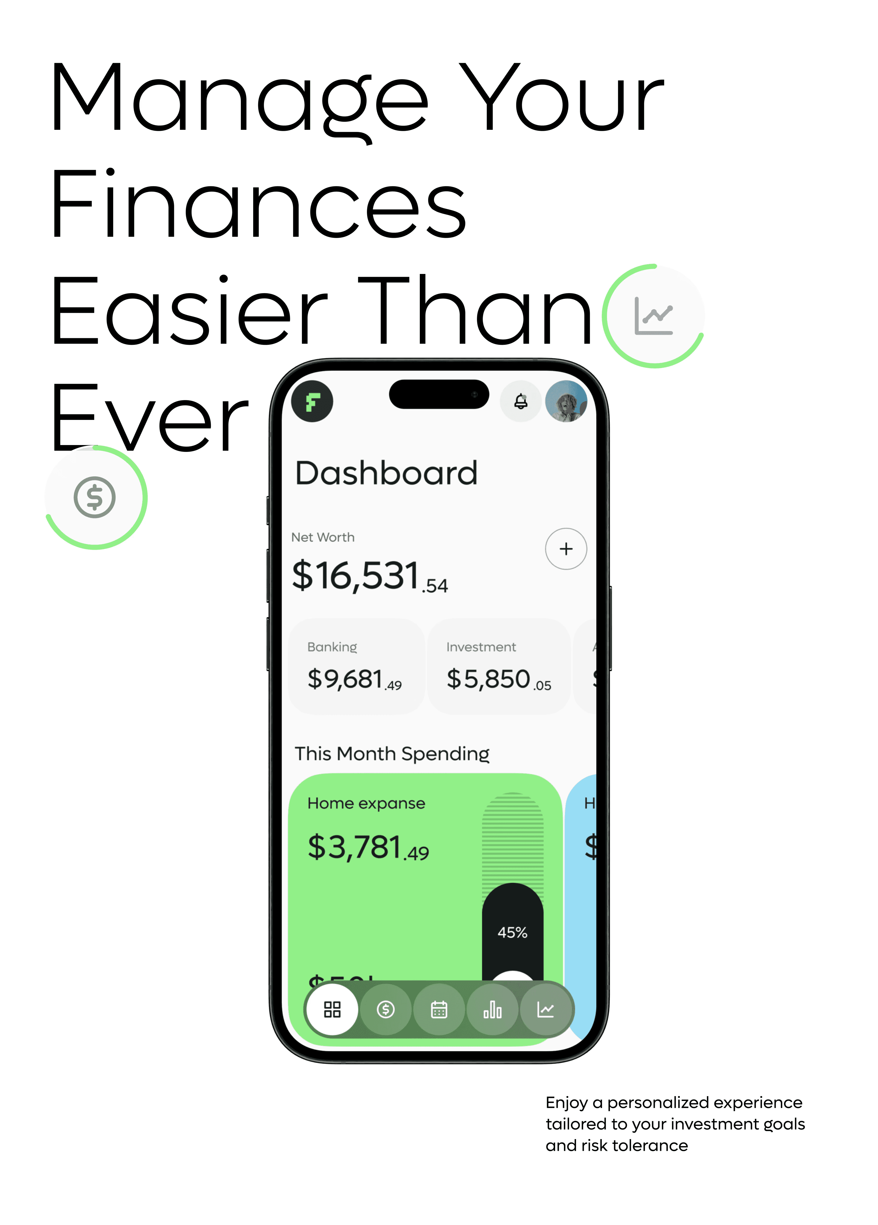
The Dashboard
The Finewise dashboard is the heart of the product and the screen where most users will spend the majority of their time. Our design goal was simple: give users everything they need to understand their financial health at a single glance.
The dashboard features:
• A net worth summary at the top with a clean visual graph showing trends over time
• Quick stats for monthly income, expenses, and savings rate
• An AI copilot widget that surfaces proactive insights and alerts
• Goal progress cards showing how close the user is to their targets
• A recent transactions feed with smart categorization
Every element on the dashboard was designed to breathe. White space is not wasted space it is what makes the data readable. The Artonest UI design philosophy always prioritizes clarity over density.
AI Copilot Interface
The AI copilot is Finewise's most innovative feature and designing its interface required a completely fresh approach. Traditional chatbots feel robotic and transactional. We wanted the Finewise AI copilot to feel like a conversation with a knowledgeable friend.
Key AI copilot features include:
• Spending alerts: "You spent 40% more on dining this month. Want tips to cut back?"
• Goal recommendations: "At your current savings rate, you will reach your emergency fund goal in 3 months. Nice work!"
• Investment nudges: "The market dipped today. Your portfolio is still on track for your 10-year goal."
Each AI message is designed with a warm, encouraging tone a direct result of our empathy mapping research. The AI never makes users feel judged for their spending habits. It only motivates and guides.
Onboarding Screens
First impressions are everything. The Finewise onboarding flow was designed to collect the essential user data income, fixed expenses, financial goals, and risk tolerance in the most painless way possible.
Our Artonest developer and designer team built the onboarding as a progressive disclosure experience. Instead of showing users a long form all at once, we broke it into small, focused steps with friendly copy, clear progress indicators, and celebratory micro-animations at each milestone. The result is an onboarding experience that users actually complete a significant improvement over the industry average drop-off rate.
Mobile App Screens
The Finewise mobile app was designed with a mobile-first approach meaning every design decision started with the smallest screen and scaled up. Key mobile screens include:
• Home Dashboard
• Expense Tracker with AI categorization
• Investment Portfolio overview
• Goal Planner with visual progress indicators
• AI Copilot chat interface
• Settings and profile customization
Every screen follows a consistent 8-point grid system, ensuring perfect alignment and spacing across all devices. Tap targets are generously sized for comfortable one-handed use. Animations are smooth but never excessive.
Apple Watch App
One of the most exciting challenges in the Finewise project was designing for Apple Watch. The tiny display forces radical simplicity and simplicity is the hardest thing to achieve in design. The Artonest design team created a Finewise Apple Watch face and companion app that gives users a real-time financial snapshot on their wrist. Key metrics daily spending, remaining budget, and a quick AI insight are presented in a glanceable format that respects the user's attention.
The Watch app uses a dark interface with bold typography and minimal color to ensure maximum readability in all lighting conditions.
Marketing Website Design
A great app needs a great website. As part of the Finewise project, our Artonest Webflow developer team designed and built a high-converting marketing website that communicates the product's value clearly and drives sign-ups.
The website features:
• A bold hero section with animated product screenshots
• Feature highlights with clear, benefit-driven copy
• Social proof sections with user testimonials
• A clean pricing section
• A strong call-to-action throughout every page
The marketing site was built in Webflow one of Artonest's core development specialties ensuring fast load times, pixel-perfect responsive design, and easy content management for the Finewise team.
Design System and Component Library
Every great product needs a great design system behind it. For Finewise, our Artonest design team built a comprehensive component library that ensures consistency across every screen, platform, and future feature update.
The Finewise design system includes:
• Color tokens for light and dark mode
• Typography scale with defined use cases
• Spacing system based on an 8-point grid
• Component library covering buttons, cards, inputs, navigation, charts, and modals
• Icon set customized for finance use cases
• Animation guidelines for micro-interactions
A robust design system is one of the most valuable deliverables an Artonest project produces. It is not just a design file it is a living document that enables development teams to build faster, maintain consistency, and scale the product confidently.

Results and Reflections
What We Built
The final Finewise product is a cohesive, multi-platform experience that includes a mobile app (iOS and Android), a web dashboard, an Apple Watch companion app, and a marketing website — all unified by a strong brand identity and intelligent AI features.
From the first empathy map to the final pixel, the Finewise project represents the full depth of Artonest's capabilities: UX research, UI design, branding, design systems, Webflow development, and product strategy.
Key Design Lessons from Finewise
1. Start with emotion, not features. The most impactful design decisions in Finewise came from understanding how users feel about money not just what they want to do with an app.
2. AI needs a personality. The Finewise AI copilot works because it has a clear, consistent voice. Designing AI features requires the same care as designing any human interaction.
3. Dark mode is not optional. For finance apps used at night and in low-light environments, a well-crafted dark mode is essential not a nice-to-have.
4. Simplicity takes more work. Every element on the Finewise dashboard is there because it earned its place. Cutting features and simplifying interfaces requires more design skill and more courage than adding them.
Work With Artonest Design Studio
Finewise is just one example of what the Artonest team creates every day for startups, scale-ups, and enterprises around the world.
At Artonest Design Studio, we offer end-to-end design and development services including:
• UI/UX Design for web and mobile apps
• Brand Identity and Logo Design
• Webflow Development and custom website builds
• Design Systems and component libraries
• Product Strategy and UX consulting
• Framer Design and interactive prototyping
Our team of experienced designers and developers works with clients across fintech, SaaS, e-commerce, health tech, and more. Whether you are building your first product or redesigning an existing one, Artonest has the expertise to bring your vision to life. Explore our full portfolio at artonest and see the wide range of industries and design challenges we have tackled.
Ready to build something great? Book a discovery call with our team at artonest and let us talk about your project.
Conclusion
The evolution from designer to AI collaborator is an invitation to do better work. By embracing AI UX design, we are reclaiming our time—time that should be spent on user advocacy, beautiful visual storytelling, and solving the world’s most interesting interface challenges. Are you ready to see how a modern, AI-integrated workflow can transform your next digital project? Contact us at Artonest today. Let’s collaborate on building the next generation of user experiences together.
Frequently Asked
Questions
1. What is Finewise?
2. Who designed the Finewise app?
3. What does UI/UX design mean in a finance app?
4. How long does it take to design a fintech app like Finewise?
5. What tools did Artonest use to design Finewise?
Recent


